Designing Accessible Mobile Apps with AI
How to use an AI design tool like TapUI to ship accessible mobile UI, plus the WCAG checks and assistive-tech testing it can't do for you.
TL;DR: Design accessibility in from the first screen instead of bolting it on before launch. An AI design tool like TapUI can pull the easy wins forward — readable contrast, clear structure, comfortable tap targets, sensible reading order — so they cost a regeneration instead of a refactor. But it can't test your shipped app with VoiceOver or TalkBack, walk your flows on switch control, or sit a real screen-reader user in front of your onboarding. Design with AA basics in the prompt, then verify on real devices with real assistive tech.
The fastest way to ship an inaccessible app is to treat accessibility as a pass you do at the end, right before launch, when the layouts are frozen and nobody wants to touch them. By then the low-contrast brand palette is locked, the icon-only buttons are everywhere, and the "fix" is a backlog ticket that never gets pulled.
A better moment to think about accessibility is the moment you're generating screens in the first place. That's the part an AI design tool can genuinely help with — and the part where it's worth being honest about what it can't do.
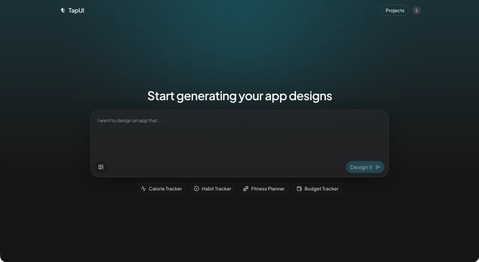 This is where you start — describe the screen and its accessibility constraints right in the prompt.
This is a practical guide to building accessible mobile UI when you're designing with TapUI. It covers what gets handled for you, what you still have to check by hand, and where the work doesn't go away no matter how good the generator is.
What accessibility actually buys you
Accessibility makes your app usable for people who rely on a screen reader, voice control, switch access, larger text, or a different color-vision profile — and it makes the app better for everyone else too. It is not a niche audience — most of us hit some version of it eventually, whether it's reading a screen in bright sun, tapping one-handed on a train, or turning the system font up a few sizes as our eyes change.
There's a regulatory angle too. Digital accessibility requirements exist in many jurisdictions — the Americans with Disabilities Act in the US and the European Accessibility Act are two commonly cited examples — and the trend is toward more coverage, not less. Treat that as a reason to get the basics right early, not as a checklist to game.
The part people underrate: accessible defaults usually just make the app better. Clear labels help everyone navigate. Honest contrast survives a cheap screen and a sunny window. Captions get watched on mute. You rarely have to choose between "accessible" and "good."
The four ideas behind WCAG
WCAG's four principles — Perceivable, Operable, Understandable, Robust (POUR) — are the framework behind every mobile accessibility requirement. The Web Content Accessibility Guidelines are written for the web, but the underlying principles map cleanly onto mobile:
- Perceivable — people can take in the content. Text alternatives for images, enough color contrast, text that survives being resized.
- Operable — people can drive the interface. Everything reachable by touch, no surprise time limits, recoverable errors.
- Understandable — it behaves predictably. Plain language, consistent navigation, error messages that say what went wrong and how to fix it.
- Robust — it works with assistive technology, present and future. Standard components, proper semantics, sensible structure.
WCAG also defines conformance levels. A is the floor. AA is the level most regulations and most teams treat as the real target — it addresses the issues that block people day to day. AAA is stricter and worth reaching for in specific places, but it's not a realistic blanket goal for a whole app. When people say "we're accessible," they almost always mean AA.
Where TapUI helps
TapUI makes it cheaper to get accessibility right by surfacing problems at the design stage, where fixing them costs a regeneration instead of a refactor. It turns a plain-text description of an app into polished mobile UI screens. If you bring accessibility into the prompt and the review, a few things get easier from the first draft instead of the last sprint.
Contrast you can see early. The fastest accessibility bug to introduce is text that looks fine on your high-end screen and disappears on a cheaper one. The AA targets are concrete: 4.5:1 for normal body text, 3:1 for large text and for the meaningful parts of UI components. Generating screens early lets you eyeball real color pairings against real layouts before a palette gets locked in, rather than discovering the problem after brand sign-off.
Structure and grouping. Good generated layouts tend to come with a real heading hierarchy and clear sectioning rather than a wall of same-size text. That structure is exactly what a screen reader leans on to let someone skim, so getting it sensible at the design stage saves rework later.
Tap-friendly targets. Comfortable hit areas help everyone, and they specifically help people with motor differences or anyone tapping on the move. The platform baselines are roughly 44×44pt on iOS and 48×48dp on Android, with enough spacing that adjacent controls don't fight each other. It's much cheaper to space things out while you're still arranging the screen than to retrofit it.
A faster loop. The real advantage isn't any single check — it's that you can describe a screen, look at it, notice the icon-only button with no label, and regenerate. Accessibility problems are cheapest when they're still pixels.
A reasonable loop looks like this:
- Name the constraints in the prompt — contrast, labels, spacing, reading order.
- Generate the screen and look at it against a real layout.
- Spot the gaps — the icon-only button with no label, the section that runs together.
- Regenerate until the baseline is clean, then move on.
A prompt that names the constraints directly:
Create a settings screen with:
- clear, legible labels (no icon-only controls)
- high-contrast text and controls
- distinct, well-spaced sections
- comfortably sized tap targets
Aim for WCAG AA contrast and a logical reading order.
You'll still review what comes back. The tool gives you a strong starting point; it doesn't grant you a clean bill of health.
What you still have to do yourself
Several accessibility checks only exist once the app is real — and those are exactly the things that determine whether someone can actually use it. A design tool can set you up well, but can't replace on-device testing with real assistive tech.
Test with the real screen readers. Nothing replaces turning on VoiceOver and TalkBack and trying to complete a task with your eyes off the screen.
- iOS — VoiceOver: Settings → Accessibility → VoiceOver. Swipe through a flow and listen to whether each element is announced as something meaningful, not "button, button, image."
- Android — TalkBack: Settings → Accessibility → TalkBack. Same idea — swipe-navigate and check that labels actually describe what things do.
Test switch and voice control. Some people never touch the screen directly. Turn on Switch Control (iOS) or Switch Access (Android) and confirm every function is reachable in a navigation order that makes sense. This routinely surfaces traps a visual review misses.
Check reading order and focus. Assistive tech follows the structure, not the picture. Confirm focus moves in a logical sequence and that the currently focused element is obvious.
Test text scaling for real. Crank the system font to its largest setting and walk the app. Look for clipped labels, truncated buttons, and layouts that collapse. This is one of the most common failures and one of the easiest to miss on a default-size simulator.
Involve people who use these tools daily. Recruiting even a few testers who rely on a screen reader, switch control, or large text will tell you more than any automated pass. Real use reveals the friction checklists don't.
On the developer-handoff side: TapUI gives you polished screens and project history you can hand to your developers to build from. The accessibility attributes that make those designs real in the running app — labels, hints, roles, dynamic-type behavior — are decisions to confirm in implementation and verify on device.
Implementation patterns worth knowing
Knowing what "accessible" looks like in code lets you spec it correctly and verify it during implementation. A few platform examples:
Descriptive labels beat generic ones. "Play workout video" is useful; "button" is not. "Profile photo of the account owner" is useful; "image" is not. Add hints only when the action isn't obvious from the label.
iOS (SwiftUI):
Button("Play") { playWorkout() }
    .accessibilityLabel("Play workout video")
    .accessibilityHint("Starts the selected session")
Android (Kotlin / View):
playButton.contentDescription = "Play workout video"
Hide purely decorative imagery so it doesn't clutter the audio experience:
Image("decorative-divider")
    .accessibilityHidden(true)
decorativeImage.importantForAccessibility =
    View.IMPORTANT_FOR_ACCESSIBILITY_NO
Respect Dynamic Type. Let the system font scale drive text size rather than hard-coding it, and verify layouts at the largest setting.
Common mistakes, ranked by how often they bite
Unlabeled controls are the most frequent and most fixable accessibility mistake — followed closely by color-only information, low contrast, missing focus indicators, and hard time limits.
- Unlabeled controls. Icon-only buttons that announce as "button." The most frequent and most fixable issue — give every interactive element a clear name.
- Information carried by color alone. A red dot that means "error" is invisible to many users. Pair color with an icon, a label, or text. Run a color-blindness simulator (protanopia, deuteranopia, tritanopia) over key screens.
- Thin contrast. Text that's technically there but practically unreadable. Hold to 4.5:1 for body text and check it, don't eyeball it.
- No visible focus. Switch and keyboard users lose their place when nothing shows what's selected.
- Hard time limits. Auto-advancing or timing-out flows shut out anyone who needs longer. Let people extend or disable them.
A few media notes
Captions, transcripts, and text descriptions for complex images are the only way some people get the content at all — they're not optional extras. And skip auto-playing audio: it's disorienting for screen-reader users and annoying for everyone else.
The honest bottom line
An AI design tool changes when you deal with accessibility, not whether you have to. TapUI's value here is that it pulls the easy wins forward — contrast, structure, tap targets, sensible reading order — to the stage where fixing them costs a regeneration instead of a refactor. You move faster and start from a better baseline.
What it doesn't do is test your shipped app with VoiceOver, walk your flows on switch control, or sit a real screen-reader user in front of your onboarding. That work is still yours, and it's the work that actually determines whether someone can use what you built.
Design with accessibility in the prompt. Review against the AA basics. Then test on real devices with real assistive tech before you ship.
FAQ
Can an AI design tool like TapUI make my app fully accessible on its own?
No. TapUI can pull the easy wins forward—readable contrast, clear structure, comfortable tap targets, sensible reading order—but it can't test your shipped app with a screen reader, walk your flows on switch control, or sit a real screen-reader user in front of your onboarding. You must verify on real devices with real assistive tech.
What WCAG conformance level should I target?
AA is the practical standard most regulations and teams treat as the real goal. A is the floor; AAA is stricter and worth pursuing for specific features, but it's not realistic for a whole app. Industry-standard "accessible" means AA.
What are the top accessibility mistakes in mobile app design?
Unlabeled icon-only controls, information conveyed by color alone, insufficient text contrast, no visible focus indicator, and hard time limits. Unlabeled controls are the most frequent and quickest to fix.
What text and component contrast ratios meet WCAG AA?
Aim for 4.5:1 for normal body text and 3:1 for large text and UI component elements. Use a contrast checker tool rather than relying on visual judgment.
Does TapUI generate production-ready code like React Native or Swift?
No. TapUI generates polished mobile UI design screens and stores your project history with design exports. It does not output code for React Native, Swift, Flutter, or other platforms. You hand the screens to developers to build the app, where accessibility attributes are implemented and tested on device.
If you want to start from accessible-by-default screens instead of a blank canvas, try TapUI. TapUI offers a free tier, plus Starter at $20/mo ($17/mo billed yearly) and Pro at $40/mo ($27/mo billed yearly) when you need more generations.
Related: Ship mobile UI faster with AI • Best v0 alternatives for mobile • TapUI pricing guide