AI Design Tools for Pitch Deck App Mockups: What Actually Works
Need polished app mockups for your pitch deck? Here's how AI design tools compare for founders raising on a mobile product, and where each one falls short.
TL;DR: "AI design tool for a pitch deck" covers two separate jobs — generating the app screens and building the slides — so pick by which job you need. For convincing native mobile screens, TapUI is purpose-built; for free, broad, web-friendly flows, Google Stitch is the strong alternative; for the deck itself, use Gamma, Slidebean, or Beautiful.ai. Generate your screens in a UI tool, then drop them into whatever deck builder fits how you're raising.
| Tool | Type | Best for | Key strength | Pricing | Native mobile |
|---|---|---|---|---|---|
| TapUI | Screen generator | Founders raising on a mobile app | Polished iOS/Android screens from a text prompt | Free tier; Starter $20/mo, Pro $40/mo | ✅ |
| Google Stitch | Screen generator | Web or mixed flows at zero cost | Broad output + wide code export, free | Free (no paid tier) | ⚠️ |
| App Alchemy | Screen generator | Prototype-first pitches | Cited for "investor-ready prototypes" | Unconfirmed — verify directly | ⚠️ |
| Gamma | Deck builder | Speed | Full deck from a prompt in under a minute | See Gamma site | ❌ |
| Slidebean | Deck builder | Fundraising structure | Startup-deck templates + investor tooling | See Slidebean site | ❌ |
| Beautiful.ai | Deck builder | Design polish | Smart slides that auto-format | See Beautiful.ai site | ❌ |
The product slide is usually where a mobile pitch wins or loses the room. You've talked through the market and the problem, the investor nods along, and then you flip to a screenshot of your app — and it's a gray wireframe with boxes and arrows. The energy drops. Suddenly the question in everyone's head shifts from "how big is this" to "can these people actually build it."
That's the gap this post is about. If you're raising on a mobile app, you need screens that look like they came out of a real product, not a sketchpad. The good news is that AI design tools have made those screens cheap and fast to produce. The catch is that "AI design tool for a pitch deck" actually covers two different categories that get muddled together, and picking the wrong one wastes a week you don't have.
Two different tools, one slide
For a mobile pitch, the right workflow is to generate your app screens in a UI tool, then drop those images into whatever deck builder you already use — because these two tool types don't compete with each other. When founders search for an "AI design tool for an investor pitch," they usually mean one of two things:
- Tools that build the deck itself — Gamma, Beautiful.ai, Slidebean. You type a prompt or an outline and they generate slides, layout, and structure.
- Tools that generate the app screens — TapUI, Google Stitch, and similar UI generators. These don't make presentations. They make the mockup that goes on the product slide.
So the rest of this guide splits along that line — first the screen generators (the part most founders underinvest in), then a quick word on deck builders.
I work at TapUI, so treat my read on it accordingly. I've tried to be honest about where the alternatives are genuinely the better pick, because picking the wrong tool for your situation is the expensive mistake here, not the subscription fee.
What investors are actually reacting to
Four things make a mockup land with investors, and none of them are exotic.
It has to look like the right platform. If you pitch a mobile app and show a website squeezed into a phone frame, anyone who uses an iPhone all day will clock it in a second. Native navigation, real tab bars, platform-appropriate spacing — these read as "this team understands the thing they're building." Web mockups dressed up as apps quietly undermine that.
It has to be legible at a glance. An investor should understand what the app does from the screen, without you narrating. Show the three or four screens that carry the story — the home view, the core action, the payoff moment — not every settings page you can imagine.
It has to be consistent. Same type, same color, same button treatment across every screen. Mismatched screens read as "assembled from templates," which is the opposite of the signal you want.
It has to use real content. Lorem ipsum and placeholder avatars make a mockup feel hollow. Real copy, plausible data, names that sound like your actual users — that's what makes the thing feel built.
None of this requires design talent anymore. It requires the right generator and a bit of editorial judgment about what to show.
TapUI — built for mobile screens specifically
Best for: founders, PMs, and designers who need convincing native mobile screens for a product slide, fast.
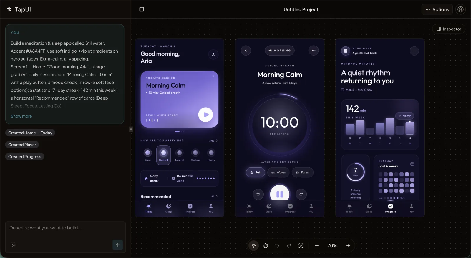 The TapUI editor turns a plain-text app description into native-looking mobile screens.
TapUI is purpose-built for mobile: you describe a mobile app in plain text — "a fintech app with an account dashboard, transaction history, and a payment flow" — and it generates polished mobile UI screens that follow iOS and Android conventions. That narrow focus is what makes the output feel native rather than generic.
For a pitch, that focus pays off in a few concrete ways. The screens come out looking like a real app, so you're not fighting the "is this a website?" problem. Because it understands platform conventions, an iOS set looks like iOS and an Android set looks like Android, which signals you've thought about the platform you're shipping on.
The other thing that matters during an active raise is iteration speed. You'll leave a meeting with a list — "what does onboarding look like," "show me the empty state," "how do people invite a friend." With a generator like TapUI you can produce those screens between meetings instead of waiting days for a designer revision. That responsiveness is its own signal.
On output beyond images: project history and exports are part of the paid plans, and the screens are designs you can hand to your developers to build from. TapUI does not generate platform code — there's no React Native, Swift, or Flutter export — so treat the output as polished mockups for your pitch, not a shippable codebase.
Pricing. There's a free tier you can use to generate your core screens without paying. Starter is $20/mo ($17/mo billed yearly) with 100 screen generations a month, project history and exports, and email support. Pro is $40/mo ($27/mo billed yearly) with 650 generations a month plus priority support. See the pricing page for the latest.
Pros: native-looking iOS/Android output, fast iteration between meetings, free tier to start. Cons: mobile-only (no web app screens), no platform code export.
Where TapUI is the wrong call: if your product is a web app — a SaaS dashboard, a marketplace, an admin tool — a mobile-only generator is the wrong shape. Use a web-focused tool instead. And TapUI doesn't build your deck; you'll still need a presentation tool for that.
Google Stitch — free, broad, and good if you're not strictly mobile
Best for: founders building web or mixed-platform products who want full flows fast at zero cost.
Stitch is completely free with a generous monthly generation allowance and no paid tier — and that combination is hard to argue with for founders who don't need strictly native mobile output. Google relaunched the former Galileo AI as Stitch, a Google Labs experiment, and it turns text, images, sketches, or voice into UI designs and frontend code. It handles multi-screen flows on an infinite canvas and exports to Figma and a wide range of code targets.
For a lot of founders that combination is hard to argue with. If you're building a web product, or you want full flows fast at zero cost, Stitch is genuinely strong, and the breadth of its code export is wider than most. The Google name doesn't hurt in a room either.
The honest trade-offs: Stitch is general-purpose, not mobile-native, so it doesn't have the same focus on producing convincing iOS/Android app screens. In-app editing is thin, design-system uploads aren't supported, and collaboration is limited. The bigger caveat is structural — it's a Labs experiment. Google has a long history of sunsetting Labs projects, and there's no SLA or committed roadmap. For a quick burst of pitch mockups that doesn't matter much. If you're planning to build a long-term design workflow on it, factor in that it could disappear.
Pros: completely free, wide code export, handles multi-screen flows, the Google name in the room. Cons: not mobile-native, thin in-app editing, no design-system uploads, limited collaboration, and Labs-experiment uncertainty (no SLA or committed roadmap).
Short version: free and excellent for web or mixed flows; less suited if your whole pitch rests on looking like a polished native mobile app.
A note on App Alchemy
Best for: founders whose top priority is an interactive prototype rather than static screens.
App Alchemy is worth a look if prototyping is your priority — third-party rankings cite it as producing "investor-ready prototypes." I haven't used it enough to vouch for the output myself, and its pricing in those write-ups comes from secondhand sources rather than the company, so confirm details directly before you commit.
The deck builders (a brief detour)
Your app screens go into a deck, and that's a separate tool. A few that founders actually use:
- Gamma generates a full deck from a prompt in under a minute and is the broad market leader for AI presentations. Output can feel generic and it isn't investor-specific, but it's fast and exports cleanly to PPTX, PDF, and Google Slides.
- Slidebean is the most fundraising-focused of the bunch — templates modeled on well-known startup decks, AI that flags jargon and missing financials, even an investor CRM. Its raw design quality trails Beautiful.ai, but for an actual raise that focus is the point.
- Beautiful.ai has the best out-of-the-box design quality; its smart slides auto-format so it's hard to make an ugly one. It's less investor-specific than Slidebean and team pricing runs higher.
- Figma Slides makes sense if your team already lives in Figma — it's bundled into paid seats — but for pitch use you're doing template work by hand.
The pattern is the same as the screen generators: pick for your situation, not for a generic "best." Slidebean if fundraising structure matters most, Beautiful.ai if design polish does, Gamma if speed does.
Practical advice for the mockup itself
Regardless of tool, a few habits separate a product slide that lands from one that doesn't:
- Show four to six screens, not twelve. Walk the core journey from entry to payoff. Anything else you can describe verbally or pull up if asked.
- Populate real content. A finance app showing a believable balance reads truer than a screen full of
$1,234,567.89. - Match your claims to your visuals. If you say iOS-first, show iOS. If you say cross-platform, show both. Mismatches read as carelessness.
- Treat every "no" as input. Ask what was unclear, regenerate the screens that confused people, and the next version of your deck is sharper. The whole reason to use an AI generator is that this loop is cheap — use it.
FAQ
Do I need to mention I used AI for the mockups?
No. Investors care whether the screens communicate your product clearly, not which tool produced them. Bring it up only if someone specifically asks about your design process.
How many screens should the product slide have?
Four to six is a good range. Show the core path from first open to the moment of value. Keep extra screens in your back pocket for questions.
iOS, Android, or both?
Match what you're claiming. Raising on a cross-platform app? Show both to demonstrate platform awareness. iOS-first? iOS is enough — just be ready to talk through the Android plan.
What if an investor asks for a screen I don't have?
Generate it afterward and follow up. The speed of producing a missing screen between meetings is one of the real advantages of working with an AI generator.
Are AI-generated mockups good enough, or do I need an agency?
For pitch-stage mockups, a good AI generator is usually enough and far faster. Agencies bring deeper customization and brand work that's worth it later — once you've raised and have both budget and a reason to invest in a full design system.
The takeaway
Your product slide is evidence, not decoration. It's the cheapest, most direct way to show a room that you can turn a vision into something real. AI tools have made that evidence accessible to founders with no design background and no agency budget.
For a mobile app, the workflow is straightforward: generate convincing native screens in a UI tool, then place them in whatever deck builder fits how you're raising. Pick for your product, not for a leaderboard:
- Raising on a native mobile app? → TapUI for the screens. Try the free tier and generate your core screens.
- Building web or mixed flows, or want zero cost? → Google Stitch (mind the Labs uncertainty).
- Prototype-first pitch? → Look at App Alchemy, but verify its details directly.
- Need the deck itself? → Slidebean for fundraising structure, Beautiful.ai for polish, Gamma for speed.