Design System First Prototyping for AI-Generated App Screens
Anchor every AI-generated screen to five small visual rules so your prototype reads as one product instead of a collage of mismatched screens.
TL;DR: AI-generated screens drift because the model reinvents radius, spacing, type, and color on every screen with no memory of the last one. Fix it by writing down five visual rules — type, color, spacing, radius, elevation — before you generate, then pasting those rules into every prompt as hard constraints. It's a ~20-line text file you build in under an hour, and it makes a stack of screens read as one product.
Generate six app screens with any AI tool, line them up, and look at the corners. Odds are the cards on screen one have a tighter radius than the cards on screen four. The settings page picked a slightly different gray. One heading is a touch larger than the same heading two screens over. None of it is wrong on its own. Together, it reads as a prototype somebody assembled, not a product somebody designed.
The fix is boring and it works: decide a handful of visual rules before you generate anything, then treat those rules as constraints the model isn't allowed to break. You don't need a component library or a design-systems hire. You need about five decisions and a text file.
What "lightweight" actually means here
A lightweight design system is the smallest set of visual constraints that makes a stack of screens feel like one product — not a Figma library with 200 variants, not a quarter-long initiative, just a short document that pins down five things:
- Type. One face for headings, one for body — or honestly, just one variable font (Inter is a safe default) and let size and weight carry the hierarchy. Fewer decisions, fewer ways to drift.
- Color. One accent, one neutral scale, one semantic color for destructive/error states. Resist naming more than five or six colors this early. You can always add later; pulling colors back out is harder.
- Spacing. A base unit and the multiples you allow. 4px base with a 4/8/12/16/24/32/48/64 scale covers most of what a phone screen needs. Every gap and pad should come from that list.
- Radius. Small, medium, large — and assign each to a job. Small for chips and badges, medium for cards and inputs, large for sheets and modals. The drift you saw in those corners? This is the rule that kills it.
- Elevation. One soft shadow for resting cards, one stronger shadow for things that float (menus, modals). Two values. Stop there.
That's a 20-line file. The point of writing it down is that you can paste it into the prompt every single time, so the model applies your rules instead of inventing fresh ones per screen.
Why drift happens (it's not the model)
Visual drift in AI-generated screens happens because the model has no memory of your previous screens — it reinvents the visual language from scratch every time. Ask a tool to "design a settings screen" and it has to invent radius, spacing, type scale, all of it, with no awareness of the four screens you already made. The next screen, it invents again. Each choice is locally reasonable. Across a flow, they don't agree.
The damage is cumulative and quiet. One screen looks fine. By the sixth, the prototype feels unsteady, and people pick up on that even when they can't name it — an interface that doesn't behave predictably is an interface they trust a little less.
The lever isn't a better model. It's a more constrained prompt. "Design a settings screen using Inter, zinc-900 background, cyan-500 accent, 8px card radius, 4px spacing base" produces something that matches what came before. The constraints have to exist before the screen does. That's the whole idea in one sentence.
This is roughly how TapUI is meant to be used, too — you describe the app in plain language and it generates polished mobile screens, and the more consistent the direction you give it, the more consistent the screens come back.
 Describe the app — and your five visual rules — right in the Studio prompt, and the generated screens come back on your terms.
Building the file in under an hour
The whole thing takes roughly 45 minutes, start to finish — five steps:
1. Calibrate your eye (0–10 min)
Open three apps in your category on your phone and look hard at type sizes, spacing rhythm, and how they spend color. You're not copying anyone. You're tuning your eye to what fits your product's tone.
2. Write the five decisions (10–25 min)
New markdown file. Write the five decisions. For each, add one sentence of why — "Inter for body because it holds up at 14–16px on mobile and has broad language coverage." The reasons are for the version of you that revisits this in a month and wonders what you were thinking.
3. Test one screen against the rules (25–40 min)
Paste the five decisions into a prompt with a real, specific brief and generate:
Home dashboard for a habit tracker showing today's progress. Use Inter, zinc-900 background, cyan-500 accent, 8px card radius, 4px spacing base.
Check whether the output actually respected the constraints. If it ignored your radius rule, reword the constraint until it sticks. You're debugging the prompt format here, not the design.
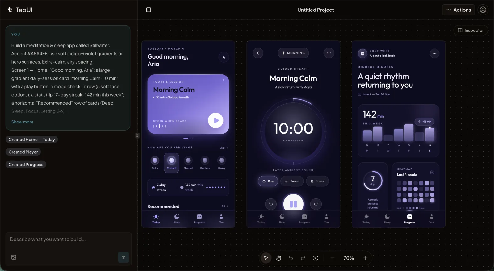 In the editor, a scoped tweak fixes an off-spec value without regenerating the whole screen.
4. Save it as the source of truth (40–45 min)
Drop the file in the repo or a shared drive. This is the source of truth, and everyone pastes from it. If you want the broader picture around this, the AI UI design workflow guide walks through where this step fits.
Keeping screens in line as you scale up
The document is necessary, not sufficient — you also need a cheap routine so the rules survive contact with twenty screens.
Per screen (30 seconds). After each generation, scan for the five. Right body font and size? Card radii correct? Spacing on the scale? If one value is off, fix it with a scoped edit prompt — don't regenerate the whole screen and roll the dice again.
Every handful of screens. Lay them side by side and look for the things that slip: heading sizes (is H1 the same H1 everywhere?), card padding, button heights across primary and secondary, and whether the accent color stayed reserved for primary actions or started leaking into decoration.
At handoff. When a screen goes to your developers, annotate the exact values. Not "some blue" — "cyan-500, #06b6d4." The designs you hand to your developers are only as useful as the tokens written on them; specific values turn implementation into translation instead of guesswork.
When the five rules don't cover something
They won't cover everything — date pickers, charts, multi-step forms all carry interaction patterns that go past color and spacing.
The pragmatic move: when a new component shows up, make one decision about it and append it to the file. "Charts: cyan-500 for the primary series, zinc-600 for secondary, axis labels in body font at 12px." Don't try to predefine the universe up front — you'll guess wrong and write rules you never use. Define things as you hit them. After a few weeks the file has grown from 20 lines to maybe 50 or 60, and that covers the large majority of what your product actually renders.
Evolving the system without re-introducing drift
Change on purpose — that's the trick that keeps a lightweight system stable. A few rules that help:
- One change per cycle. Move the accent color and the spacing scale in the same week and you won't know which one caused the regression you're now staring at.
- Propagate backward. Bump card radius from 8px to 12px? Update the screens you already made. Leaving old screens on the old value is exactly the drift you started this to prevent.
- Write down why. A one-line changelog entry — what changed, and the reason — saves the next person (often future-you) from relitigating a settled decision.
- Version it. In git this is free. In a shared doc, put a number at the top and bump it.
Where this fits next to Material, Ant, or Chakra
The lightweight approach buys momentum; mature systems buy depth — and both trade-offs are real. Mature systems like Material, Ant, and Chakra are genuinely better when you need them: accessibility baked in, dozens of documented components, behavior specified for the edge cases, governance for a team that's outgrown a text file. If you have many engineers across several surfaces and a long maintenance horizon, that depth is the point, and a five-decision file will leave real gaps — component states, focus handling, dense data patterns it was never meant to cover.
What the lightweight approach buys is momentum. It's built for the prototyping phase, where speed matters more than completeness, and it gets you most of the consistency for a sliver of the setup. The two aren't rivals. Plenty of teams run the lightweight file through prototyping, then graduate to a full system for production — and because the file already records the core decisions, that migration is additive rather than a rewrite.
FAQ
How is this different from using Tailwind or shadcn?
A framework hands you primitives; your lightweight system records which primitives to use and where. Tailwind gives you rounded-md and rounded-lg but doesn't tell you which applies where. The lightweight system sits a layer above and records your choices so they stay consistent across screens and teammates.
Does a solo developer need this?
Yes — solo developers arguably benefit most, because there's no second pair of eyes to catch inconsistency. The file takes fifteen minutes to build and saves hours of cleanup later, and it sharpens your prompts since the model gets clear constraints instead of an open-ended ask.
We already have a Figma library. How do we use this approach?
Pull the five core decisions out of it and write them as plain text you can paste into prompts. Figma stays the source of truth for implementation detail; the text summary ensures generated screens line up with the library without the model having to read Figma.
How do dark and light modes fit into a lightweight system?
Add a second column to the color decision with light and dark values for each named color, then name the target mode in your prompt. Don't generate both modes at once; pick a default, generate the other as a separate pass.
When should we graduate to a full design system?
Graduate when the text file stops keeping up — usually when many people are working the same surface, or you've got enough production screens that a 50-line doc can't hold the line on component detail. Below that threshold, a full system adds overhead; above it, missing component documentation starts costing time.
Can we use this approach with AI UI generators like TapUI?
Yes. Paste your five visual rules directly into the TapUI Studio prompt alongside your plain-language app description, and the generated screens come back consistent with your design system. The more specific your constraints, the more aligned the output.
Related:
- How to Design App UI with AI
- Start designing with TapUI — free tier available