iOS vs Android Design with AI: What Actually Changes Between Platforms
How iOS Liquid Glass and Android Material 3 Expressive differ in 2026, and how to brief an AI design tool so screens feel native on each.
TL;DR: iOS (Liquid Glass) and Android (Material 3 Expressive) diverged further in 2025-2026, so "design once, ship everywhere" looks worse than ever. The fastest tells of a non-native screen are the FAB (Android only), the system font (SF Pro vs Roboto), tap-target size (44pt vs 48dp), and the date picker (wheel vs calendar grid). When using an AI tool, name the platform and its conventions in the prompt, then review output against those before you ship.
A login screen that looks right on iPhone can look subtly broken on a Pixel. The button sits a few pixels too small. The font is wrong. There's a back arrow in the top-left where Android users expect a system gesture. Nobody can point to a single defect, but the app "feels off" — and that feeling is usually a pile of small platform-convention violations the designer never consciously made.
This is the trap with AI design tools. They're fast, but speed makes it easy to ship one set of screens to both stores and assume the differences don't matter. They do. As of 2026, the gap between the two platforms is actually widening, not shrinking — Apple and Google both shipped their biggest visual overhauls in years within months of each other. If you're generating UI with AI, you need to know what those overhauls changed and how to ask for the right one.
The differences that actually trip up generated screens, at a glance
Before the philosophy, here's the concrete divergence you can check generated screens against:
| iOS (HIG / Liquid Glass) | Android (Material 3 Expressive) | |
|---|---|---|
| Visual style | Translucent glass, depth, refraction | Bold color, expressive shapes, spring motion |
| Primary navigation | Bottom tab bar, gesture-back | Bottom nav, back gesture/button, FAB |
| System font | SF Pro (New York for serif) | Roboto |
| Minimum tap target | 44×44 pt | 48×48 dp |
| Primary action | In the nav bar or tab bar | Floating action button (FAB) |
| Date input | Scrolling wheel picker | Calendar grid |
| Notifications | Modal alerts | Snackbars and dialogs |
| Customization | Constrained, Apple-controlled | High — dynamic color from wallpaper |
The two design systems are moving in opposite directions
iOS and Android are now the most visually distinct they've been in years — and the directions they chose reveal fundamentally different philosophies.
Apple introduced Liquid Glass at WWDC in June 2025 — its most significant visual redesign since iOS 7 in 2013. It's a translucent material that refracts and reflects whatever is behind it, applied across tab bars, navigation, the dock, icons, widgets, and controls in iOS 26 and its sibling OSes. The headline behavior: tab bars now shrink as you scroll into content and expand again when you scroll back. The interface gets out of the way of the content, then returns when you need it. That's classic Apple — deference to content, depth through layering rather than hard edges.
Google went the other way with Material 3 Expressive, announced at I/O in May 2025 and rolled out to Pixel 6 and newer through Android 16 QPR1 by September. It's an evolution of Material You, not a new "Material 4," and it leans into expression: 35 new shape options with shape-morphing transitions, spring-based motion physics, larger and bolder typography, and a batch of refreshed components like button groups and split buttons. Notably, Google built this on real research — 46 studies and tens of thousands of participants — rather than pure aesthetics. The result is louder, more physical, more customizable.
So: Apple is making the chrome disappear into glass. Google is making it bolder and springier. An AI tool that doesn't know which one you want will average them into something that belongs to neither.
The details reviewers and users notice immediately
A handful of platform details are so visible that getting them wrong immediately marks a screen as non-native — these are the ones worth memorizing.
The floating action button is the giveaway. Android puts the primary action in a circular FAB, usually bottom-right, floating above content. iOS has no equivalent — primary actions live in the navigation or tab bar. A FAB on an iPhone screen instantly reads as "this was designed for Android and ported." It's the single fastest way to spot a non-native layout.
Fonts don't travel. SF Pro ships on iOS; Roboto ships on Android. Ask for the wrong one and, on a real device, it either fails to render or silently falls back to the system default — which means your carefully chosen typography evaporates. This is not a stylistic preference; it's a rendering reality.
Tap targets differ by four points. 44×44 pt on iOS, 48×48 dp on Android. Small, but it compounds across a dense screen and affects accessibility.
Date pickers are a philosophy in miniature. iOS defaults to a scrolling wheel; Android shows a calendar grid. Generate a "date of birth" field without specifying the platform and you'll frequently get the wrong one.
Notifications and back navigation. iOS leans on modal alerts and handles "back" within the app's own interface (plus the edge-swipe gesture). Android uses snackbars and dialogs and treats back as a system-level affordance — so adding an in-app back button on Android often duplicates what the OS already provides.
How to brief an AI tool so it picks the right side
The biggest lever you have over AI-generated UI is specificity in the prompt — naming the platform and its conventions up front tightens the output dramatically.
A prompt like "a mobile app login screen" gives the model nothing to anchor on, so it produces a platform-agnostic average. Name the platform and the convention you care about instead.
For iOS, reference the system explicitly: "an iOS settings screen following the Human Interface Guidelines, with a bottom tab bar, SF Pro typography, and a scrolling wheel date picker." For Android: "an Android settings screen using Material 3 Expressive, with bottom navigation, a floating action button, Roboto type, and a calendar date picker."
In TapUI, you describe the app in plain language and it generates polished mobile UI screens — so the same principle applies. Tell it the platform and the patterns up front rather than after the fact. If you're designing for both, the workflow that tends to work best is platform-first: get one platform completely right, then ask for the other as a deliberate adaptation ("take this iOS flow and rework it for Android with Material 3 patterns") rather than a mechanical copy. Translating component-for-component is how you end up with an iOS sheet awkwardly pretending to be an Android dialog.
A practical caution: keep brand identity consistent across both, but let navigation and interaction diverge. Same colors, same logo, same voice — different button placement, different motion, different pickers. Users should recognize your app on both platforms while each version still feels like it belongs there.
Whatever tool you use, review the output against the table above before you ship. AI gets the broad strokes right most of the time and the edge cases wrong some of the time — and the edge cases are exactly what makes an app feel native.
The AI design tools, and where each one fits
No single AI design tool wins on every axis — the right pick depends on whether you need code export, mobile focus, or integration with an existing workflow.
Here's an honest read on the main options discussed here.
TapUI
Best for: founders, PMs, and designers who want fast, polished, on-brand mobile screens they can show stakeholders and hand to developers.
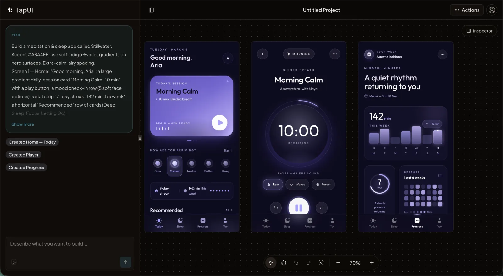 The TapUI editor turns a plain-language app description into finished mobile screens.
TapUI is built for one job: you write a description, it produces polished mobile app screens fast. You get to a credible, on-brand screen in minutes, keep project history, and can export your designs to hand off to your developers.
- Pros: mobile-focused; output looks finished and on-brand rather than wireframe-generic; quick from prompt to a stakeholder-ready screen.
- Cons: it does not generate platform code (no React Native, Swift, or Flutter export) — you hand off designs, not a codebase; mobile-only, so it isn't the pick for general web UI.
Pricing: a free tier, plus Starter at $20/mo ($17/mo billed yearly — 100 screen generations/mo, project history and exports, email support) and Pro at $40/mo ($27/mo billed yearly — 650 generations/mo, everything in Starter plus priority support).
Google Stitch
Best for: teams who want free, broad framework export and Google backing.
Google built Stitch from the Galileo AI team it acquired in May 2025, and it turns a prompt or image into high-fidelity UI plus frontend code, exporting to a wide range of targets including Flutter, SwiftUI, Tailwind, and Figma. The March 2026 update added an infinite canvas, multi-screen generation, and IDE integration.
- Pros: free; broad code export across many frameworks; backed by Google.
- Cons: output can feel generic and lose cohesion across screens; not mobile-specific; lives in Google Labs, where free tiers carry real shutdown-or-paywall risk and some regions face access restrictions.
UX Pilot
Best for: higher-fidelity results from a tool trained specifically on UX/UI data, rather than a generalist model.
Sleek
Best for: mobile work where you want clean, exportable Figma layers.
Uizard
Best for: paper-first workflows — turning sketches and screenshots into mockups.
Figma (First Draft, Figma Make)
Best for: teams already deep in the Figma ecosystem who want AI plugged into it — though the AI is retrofitted onto a tool that predates it.
How to choose
There's no single winner here — match the tool to the job:
- Need broad code export across many frameworks, for free? → Google Stitch.
- Need fast, polished mobile screens to show stakeholders and hand to a developer? → TapUI.
- Need the highest-fidelity UX-trained output? → UX Pilot.
- Working paper-first from sketches? → Uizard.
- Already living in Figma? → Figma's First Draft / Figma Make.
- Want clean mobile Figma layers? → Sleek.
A short, honest closing
The platforms are diverging, not converging. Liquid Glass and Material 3 Expressive give iOS and Android more distinct personalities than they've had in years, which means "design once, ship everywhere" produces worse results in 2026 than it did a couple of years ago. AI doesn't remove the need to know the difference between a FAB and a tab bar — it just makes it faster to get either one, including the wrong one.
Use AI to move quickly, name your platform and conventions explicitly, and keep a human eye on the parts that make an app feel native. That's the whole game.
FAQ
What's the single biggest tell that a screen was designed for the wrong platform?
The floating action button (FAB). Android puts the primary action in a circular FAB, usually bottom-right; iOS has no equivalent and keeps primary actions in the navigation or tab bar. A FAB on an iPhone screen instantly reads as an Android design ported over.
Can I reuse the same fonts on both platforms?
No. SF Pro ships on iOS and Roboto ships on Android. Using the wrong font either fails to render or silently falls back to the device default on a real device, so your typography disappears.
What should I include in an AI prompt to get native-looking screens?
Name the platform explicitly. For iOS: reference the Human Interface Guidelines, bottom tab bar, SF Pro type, and scrolling wheel date picker. For Android: reference Material 3 Expressive, bottom navigation, FAB, Roboto type, and calendar date picker.
Does TapUI export React Native, Swift, or Flutter code?
No. TapUI generates polished mobile UI designs you can export to hand off to developers, but does not produce platform code. If code export across frameworks is your priority, Google Stitch is a better fit.
Should I design one platform first or both simultaneously?
Platform-first works best: get one platform completely right, then adapt the other deliberately rather than copying component-for-component. Keep branding consistent, but let navigation, motion, and pickers diverge by platform.
Want to try it? Generate mobile screens with TapUI and brief it on the platform you're targeting.