How to Ship Mobile UI Faster with AI: A Practical Workflow
A working method for generating mobile app screens with AI fast, without losing visual consistency or shipping screens that fall apart in handoff.
TL;DR: To ship mobile UI faster with AI, decide three things before you generate — who the screen is for, the one job it does, and how you'll know it worked — then prompt for outcomes instead of aesthetics. Edit screens in place rather than regenerating, lock a tiny five-decision design system, and run a quick readability, touch-target, and state check before handoff. The discipline matters more than the tool.
Most of the time lost between "we need an onboarding flow" and an actual screen isn't spent designing. It's spent resolving things nobody decided yet. How many steps? What do we collect on each one? Where do the trust signals go? Every one of those open questions becomes a Slack thread, a speculative mockup, or a meeting.
AI generation can collapse that loop hard. But only if you bring the decisions to the tool instead of asking the tool to make them for you. Hand a model "modern dark dashboard with cards" and you'll get something that photographs well and means nothing. The discipline below is what separates a fast workflow from a pile of pretty, incoherent screens.
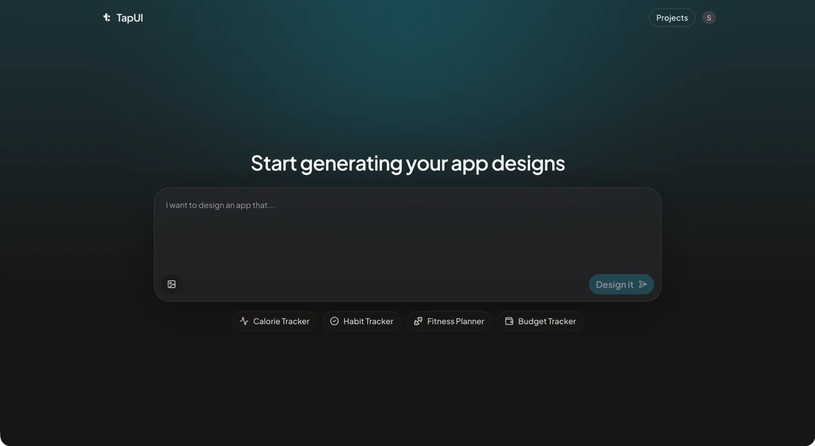 Describe the app in plain text in TapUI Studio, and it returns polished mobile screens.
Decide three things before you open anything
Ambiguity is the real bottleneck — kill it before generation starts. Three short answers do most of the work:
- Who is this for — one sentence, with context. Not "a user" but "a freelance photographer checking bookings on their phone between shoots."
- What the screen has to get done — the single job it must help someone finish in one sitting.
- How you'll know it worked — the outcome you're actually after, even if it's qualitative ("a first-time user understands what to do without tapping into a help screen").
Writing these down takes a few minutes. Skipping them is what turns a one-hour session into an afternoon of regenerating screens hoping the model reads your mind.
Prompt for outcomes, not aesthetics
Prompting for what a screen should do — not how it should look — is the single most effective change you can make to your generation workflow. Looks are downstream of intent. Give the model the intent and it spends its effort on layout quality instead of guessing.
Anchor each prompt on three things:
- What the screen is — "the daily progress view for a habit-tracking app."
- The one action that matters — "the user should see today's completion rate immediately and tap to log a habit."
- The constraints — "reuse the existing tokens: near-black background, cyan accent. Two card types max. No horizontal scroll."
The difference is stark in practice.
Weak prompt:
Generate a settings page for a mobile app.
Strong prompt:
Generate a settings screen for a personal finance app aimed at working adults. The primary action is toggling notification preferences. Group settings into Account, Notifications, and Privacy. Single column, clear section headers, comfortable body text, and touch targets large enough to hit without zooming.
The strong version removes the guesswork. In TapUI, where you describe an app in plain text and get back polished screens, that specificity is the whole game — the more intent you give it, the less you fight the output afterward.
One small habit pays off later: keep a running log of your prompts, one line per screen. Weeks from now, when you need to tweak a screen, you'll know exactly what produced it instead of reverse-engineering your own work.
Edit in place; don't regenerate
Scoped edits converge faster than regeneration — they keep every good decision the model already made and fix only the one thing that's wrong. Full regeneration throws away everything along with the one bad call, and you start over.
Work in tight, scoped edits instead:
- Find the single weakest element. Screenshot the screen and name the one thing that fails — the CTA is too small, the cards are crowded.
- Write an edit that touches only that. For example:
Make the primary button taller and add breathing room between the stat cards.
- Compare side by side. If the fix improved the target without wrecking anything around it, keep it. If it dragged something else down, throw the edit away, not the screen.
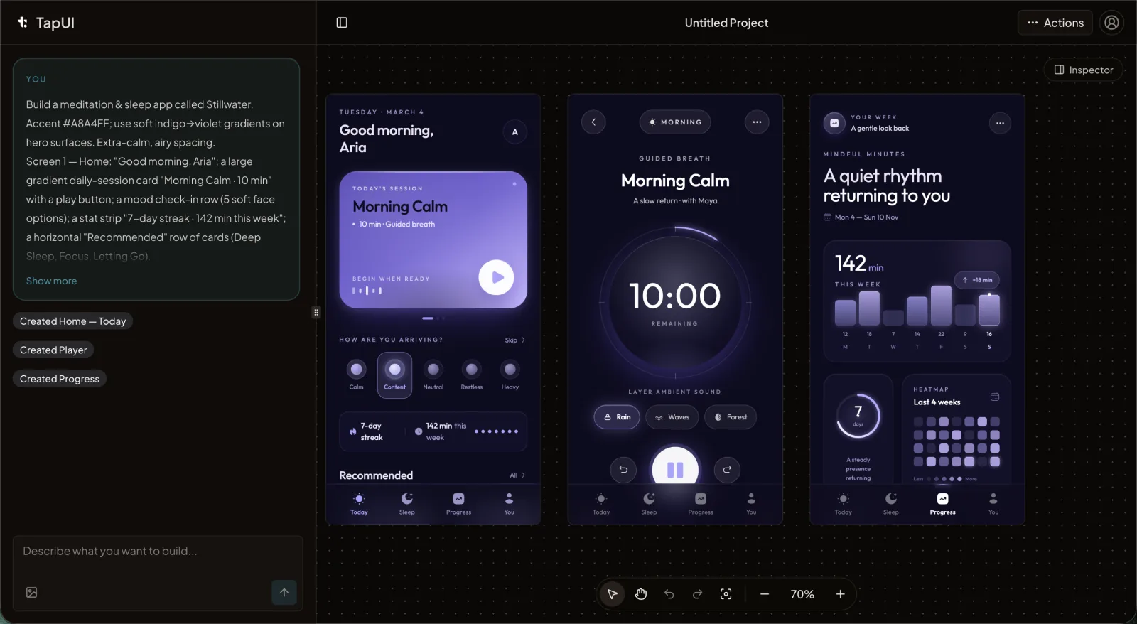 Scoped edits in the editor preserve the good decisions instead of regenerating the whole screen.
This converges fast — usually a handful of passes per screen. The teams that regenerate from scratch tend to loop far more and end up with screens that don't feel like they belong to the same app.
For a five-screen flow, a rhythm that works:
- First pass: generate all five with outcome-driven prompts.
- Second pass: review each for hierarchy and whether the primary action is obvious. Apply scoped edits.
- Third pass: consistency sweep across all five — spacing, color, type scale. Fix the drift.
It's a session, not a sprint. Compare that to sketching, wireframing, and high-fidelity mockups for the same scope, which routinely stretches across several days.
Lock a tiny design system early
Five decisions are enough to keep AI-generated screens consistent — you don't need a sprawling Figma library. Small teams skip design systems because the phrase conjures a month of setup, but for AI-assisted work you need far less:
- Type — one display face for headings, one for body.
- Color — an accent, a neutral scale, and one semantic color for errors and warnings.
- Spacing — a base unit and the multiples you'll allow.
- Radius — a small, medium, and large step.
- Elevation — one shadow for cards, one for modals.
Put these in a single file and paste them into every prompt as context. That's what keeps the model applying your system instead of inventing a fresh one on each screen. Once three or four screens feel right, pull out the recurring patterns — the card, the button hierarchy, the list row — and save them as references. You don't need a component library. You need a cheat sheet that stops the drift.
For more on these foundational choices, see our design systems guide on the blog.
Three checks before a screen moves on
Run a quick scan on every screen before it advances — speed without review just defers the pain to handoff. Three things cover it:
Can people read it? Body text large enough to read at arm's length, headings clearly distinct from body, and enough contrast that text holds up in sunlight.
Can people tap it? Interactive targets big enough to hit reliably — Apple's Human Interface Guidelines and Google's Material both publish minimums worth following — with enough space between adjacent targets that fingers don't overlap them.
Does it handle the messy states? Loading, empty, error, success. If the screen needs them and doesn't show them, that's your next prompt.
This is a quick per-screen pass, not an audit. Mark each check pass or fail. Failures get a scoped edit; everything else moves to the dashboard where you can pull the designs together and hand them to your developers.
Fitting it into a real week
A small team can run this without ceremony — the constraint-first habit is what makes the schedule work. A PM, designer, and engineer: the PM frames the screens early in the week with those three constraints. The designer generates, iterates in place, and runs the checks while the engineer sanity-checks feasibility. Midweek you do the cross-screen consistency sweep. Then implementation starts while the designer queues up the next batch of briefs.
The point isn't a rigid schedule. It's that the constraint-first habit and in-place editing let one designer keep a real pipeline moving instead of getting stuck regenerating the same screen.
Where this approach has limits
AI-generated screens are best treated as high-fidelity starting points, not finished production assets — the layout and component choices transfer cleanly when they're anchored to a design system, but a person still owns the final implementation. Non-designers can absolutely handle the constraint step, since defining the user and the job is a product skill. They tend to struggle more with the review checks, especially judging hierarchy and touch-target sizing; a short checklist with example screenshots closes most of that gap. And if your app leans on heavy custom interactions or platform-specific behavior, expect to do more by hand than a generator will give you.
The short version
- Decide who it's for, what it does, and how you'll know it works — before you generate anything.
- Prompt for outcomes, not adjectives.
- Edit in place to keep the good decisions; regenerate only as a last resort.
- Lock a five-decision design system and paste it into every prompt.
- Run a fast readability, touch-target, and state check on every screen.
FAQ
Does AI-generated UI hold up for production, or just prototypes?
Treat the output as a high-fidelity spec, not a finished build. The layout, spacing, and component choices carry over well when anchored to a design system — most teams have an engineer implement the screen with real components rather than shipping the raw output as-is. This approach works because you're giving developers a solid spec they can build against.
How do you keep 20-plus screens visually consistent?
Paste your five design tokens — color, spacing, type, radius, elevation — into every prompt as context. Do a side-by-side consistency sweep every few screens to catch drift in spacing, sizing, and color before it compounds. This habit takes an hour and prevents days of rework later.
What tools do I need to get started?
At minimum, a generation tool that supports iterative edits, a place to store your design tokens (a text file works), and a way to compare versions side by side. TapUI covers generation and editing; you can start free, then upgrade to Starter ($20/mo) or Pro ($40/mo) if you need more monthly generations or priority support. The discipline of constraining upfront matters more than the specific tool.
Can a non-designer use this workflow?
Yes. The constraint-gathering step — defining the user, the job, and the success outcome — is a product skill, not a design skill. Non-designers tend to need help with the review checks (judging hierarchy and touch-target sizing), but a checklist with reference screenshots closes that gap quickly. Pair them with a designer if possible for the quality-assurance pass.
Does TapUI export code for React Native, Swift, or Flutter?
No. TapUI generates mobile UI designs that you hand to developers to implement. It does not export React Native, Swift, Flutter, or any native platform code. The output is a spec and visual reference for development.
Related: Validate app ideas without coding • Accessible app design guide • TapUI pricing and plans